Tooltips on mouse hover are a common, effective way to add info. They don’t clutter the interface. Tooltips are small pop-up boxes that appear when a user hovers over an element, such as a button or text. They are a great way to offer contextual information, explain features, or provide guidance.
This tutorial will show how to make great tooltips using HTML, CSS, and JavaScript. Also, you’ll find answers to common questions on tooltips. They will help you handle tooltips per device and ensure users have the best experience.
Creating a Basic Tooltip with HTML and CSS
1. HTML Structure
To create a tooltip, you’ll need a simple HTML structure. Here’s an example:
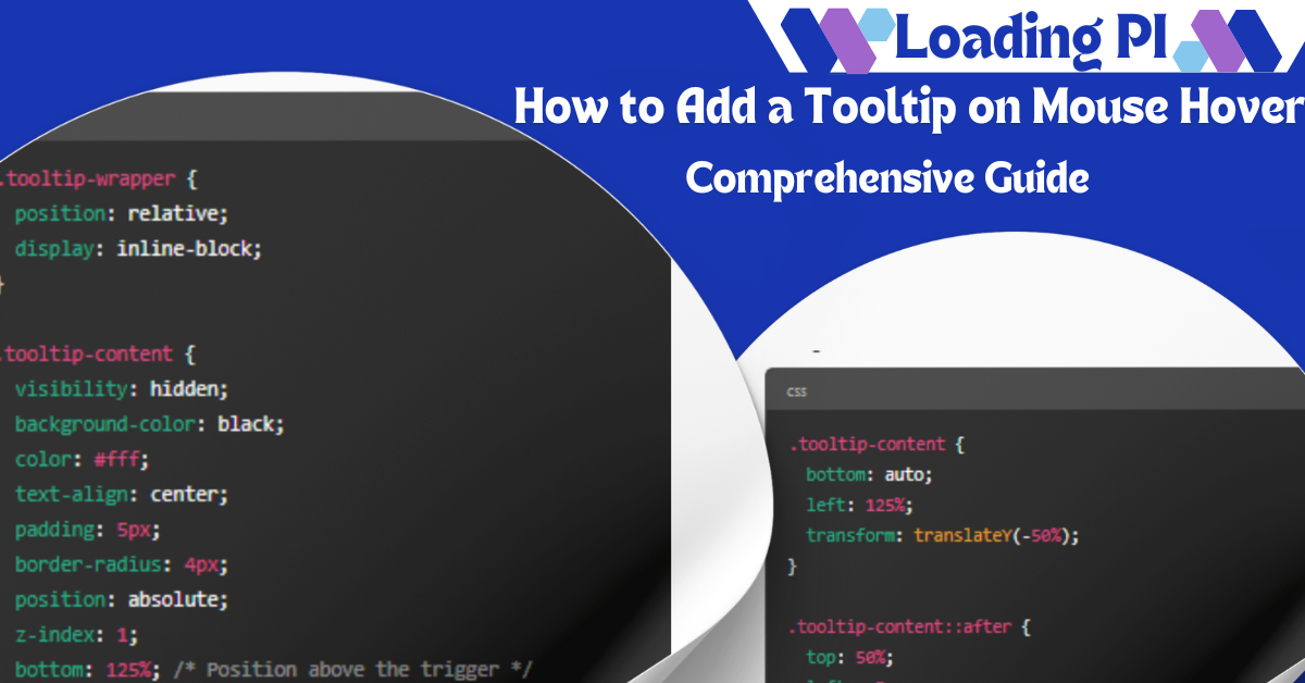
<div class=”tooltip-wrapper”>
<button class=”tooltip-trigger”>Hover over me!</button>
<div class=”tooltip-content”>This is a tooltip</div>
</div>
In this code, the tooltip-wrapper contains the element that triggers the tooltip (tooltip-trigger) and the actual tooltip content (tooltip-content).
2. CSS Styling
Next, you can style the tooltip using CSS to ensure it appears when the user hovers over the trigger element. Here’s a simple CSS setup:
.tooltip-wrapper {
position: relative;
display: inline-block;
}
.tooltip-content {
visibility: hidden;
background-color: black;
color: #fff;
text-align: center;
padding: 5px;
border-radius: 4px;
position: absolute;
z-index: 1;
bottom: 125%; /* Position above the trigger */
left: 50%;
transform: translateX(-50%);
opacity: 0;
transition: opacity 0.3s;
}
.tooltip-wrapper:hover .tooltip-content {
visibility: visible;
opacity: 1;
}
This CSS code positions the tooltip above the trigger element and hides it by default. When the user hovers over the trigger element, the tooltip becomes visible.
Read Also: Best Coding Practices
3. Adding an Arrow
To add a small arrow to your tooltip, you can use CSS’s ::after pseudo-element:
.tooltip-content::after {
content: “”;
position: absolute;
top: 100%; /* Arrow will be below the tooltip */
left: 50%;
transform: translateX(-50%);
border-width: 5px;
border-style: solid;
border-color: black transparent transparent transparent;
}
This code creates a small triangle that serves as the arrow pointing to the trigger element.
4. Adjusting Tooltip Position
You can move your tooltip to the left, right, or top of the trigger element by changing the top, bottom, left, and right properties. For example, to move the tooltip to the right of the element:
.tooltip-content {
bottom: auto;
left: 125%;
transform: translateY(-50%);
}
.tooltip-content::after {
top: 50%;
left: -5px;
transform: rotate(90deg);
border-color: transparent transparent transparent black;
}
This customization allows for flexible tooltip positioning depending on your design needs.
Adding JavaScript for Dynamic Tooltips
For more interactive tooltips, you can use JavaScript. This allows you to display tooltips dynamically based on user actions, such as clicks or focus events. Here’s a basic example:
const trigger = document.querySelector(‘.tooltip-trigger’);
const tooltip = document.querySelector(‘.tooltip-content’);
trigger.addEventListener(‘mouseover’, () => {
tooltip.style.visibility = ‘visible’;
});
trigger.addEventListener(‘mouseout’, () => {
tooltip.style.visibility = ‘hidden’;
});
This code ensures that the tooltip is only visible when the user hovers over the trigger element.
Conclusion
Tooltips are a great way to share info without cluttering the interface. They keep the UI clean and easy on the eyes. If you code your websites with HTML, CSS, and JavaScript, you can customize the tooltips that appear on mouse hover. This guide discussed tooltips in their most basic form. To customize them, you can add animations or make them respond to certain situations.
Frequently Asked Questions (FAQ)
How Do I Show Text on Mouse Hover?
To show info when the mouse hovers, we must create a hidden tooltip with CSS. It must then be made visible on hover. You can achieve this using the :defined by specific functional state of HTML elements in web site layout and called hover pseudo-class in CSS. The format that will be used for formulating the treatment section of the paper will be explained in detail in the example above.
How Do I Create an HTML Tooltip?
To create an HTML tooltip, define a trigger element (e.g., a button or text) and another for the tooltip content. Use CSS to position the tooltip and control its visibility. Refer to the CSS and HTML examples earlier in this guide.
Read More: Learn Coding for Free
How to Change the Position of a Tooltip?
To achieve that, add top, bottom, left, right specific CSS styles in this case to change the position of a tooltip. You can also move the tooltip’s arrow accordingly by modifying its ::, are applied after pseudo-element styling.
Read Also: What Is RJ45 Color Code?